The question
When a telecom carrier sees 14.5% of its customers churn in a given period, the first strategic question is whether the churn has structure — is it concentrated in specific regions, plan types, or customer segments — or whether it’s diffuse and customer-level. The answer determines the retention strategy. Geographic concentration points toward regional marketing and retention campaigns. Customer-level diffusion points toward individual intervention models and service-line targeting.
The data
3,335 customer records across all 51 U.S. states and DC. Each record held:
- Account length and area code
- Service plan indicators (international plan, voicemail plan, voicemail message count)
- Usage metrics — day, evening, night, and international minutes, calls, and charges
- Customer service call count
- Churn flag (the dependent variable)
Method
I worked the diagnosis in four passes:
- Baseline churn rate. 14.5% overall. Anything significantly above or below this line is worth investigating.
- Geographic segmentation. Pivot table of churn rate by state, mapped onto a U.S. choropleth to look for regional clustering.
- Service plan segmentation. Churn rate broken out by international plan flag, voicemail plan flag, and service call count.
- Usage segmentation. Churn distribution across deciles of day minutes, with customers split by churn status to see which usage bands over-index for attrition.
Geographic finding: there isn’t one
The first pass looked for regional patterns. There weren’t any.
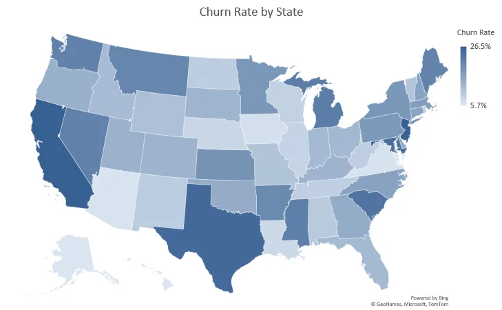
State-level churn rates ranged from roughly 6% (Alaska, Hawaii, Iowa) to 26.5% (California, New Jersey) — a spread that sounds large until you look at the map. Neighboring states don’t share similar rates. California is high, but Oregon and Arizona are average. Texas is high (25%), but Oklahoma and Louisiana aren’t. The heat map is noise, not signal.
That’s a valuable negative finding. A retention program built on “win California back” would have been expensive and poorly targeted.
The real signal is in usage intensity
The second pass found the pattern worth acting on:
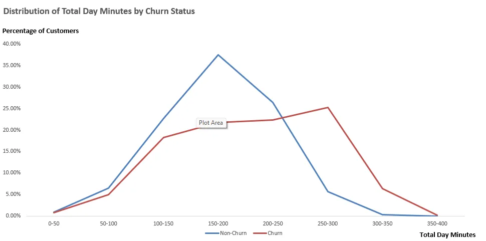
The two distributions diverge dramatically above 200 day-minutes. Non-churning customers cluster tightly around 150–200 minutes of daytime usage, with very few customers above 300 minutes. Churning customers are distributed rightward — their modal usage band is 250–300 minutes, and over 30% of them use 250+ minutes per period.
This is a product-level signal, not a customer-level one. High-usage customers are disproportionately leaving. Several possible explanations:
- Pricing structure. Plans may price heavy daytime usage unfavorably, causing high-minute customers to recalculate and switch carriers for a better fit.
- Network experience. Heavy users encounter more call quality issues simply by virtue of longer time on the network.
- Competitive vulnerability. High-value customers are the ones competitors target most aggressively.
Combined with a second finding from service plan segmentation — customers with 4+ customer service calls churn at sharply elevated rates — the picture becomes coherent. The carrier is losing its most valuable customers (high usage, more likely to hit service friction, most valuable to competitors), not its occasional ones.
Recommendation
The findings point to a product and pricing audit, not a regional campaign:
- Build a “high-minute, high-risk” customer segment and flag them for proactive retention outreach before service complaints accumulate.
- Audit pricing for heavy daytime users. If the plan economics make a 300-minute/day user pay disproportionately more than a 200-minute/day user, that gap is probably the single highest-ROI place to intervene.
- Deprioritize state-level retention campaigns in favor of usage- and service-behavior-driven segmentation.
Limitations
The cleanest limitation: correlation, not causation. High day-minute usage is associated with churn, but the mechanism is ambiguous. Is it the bill shock? The experience? The pricing fit? A regression model with controls, or ideally an experiment — like randomly assigning a subset of high-minute customers to proactive outreach or plan review — would disentangle these. The current analysis points toward where to experiment, not which mechanism is primary.
Reflection
What I took from this: the first useful thing segmentation analysis does is kill bad hypotheses. Before this analysis, “is churn geographic?” was an open question, and plenty of people on the business side assumed yes. Spending a day putting a choropleth together and seeing that it was essentially random noise saved what could have been months of misdirected retention spending. A negative finding, firmly established, is worth more than a noisy positive one.